


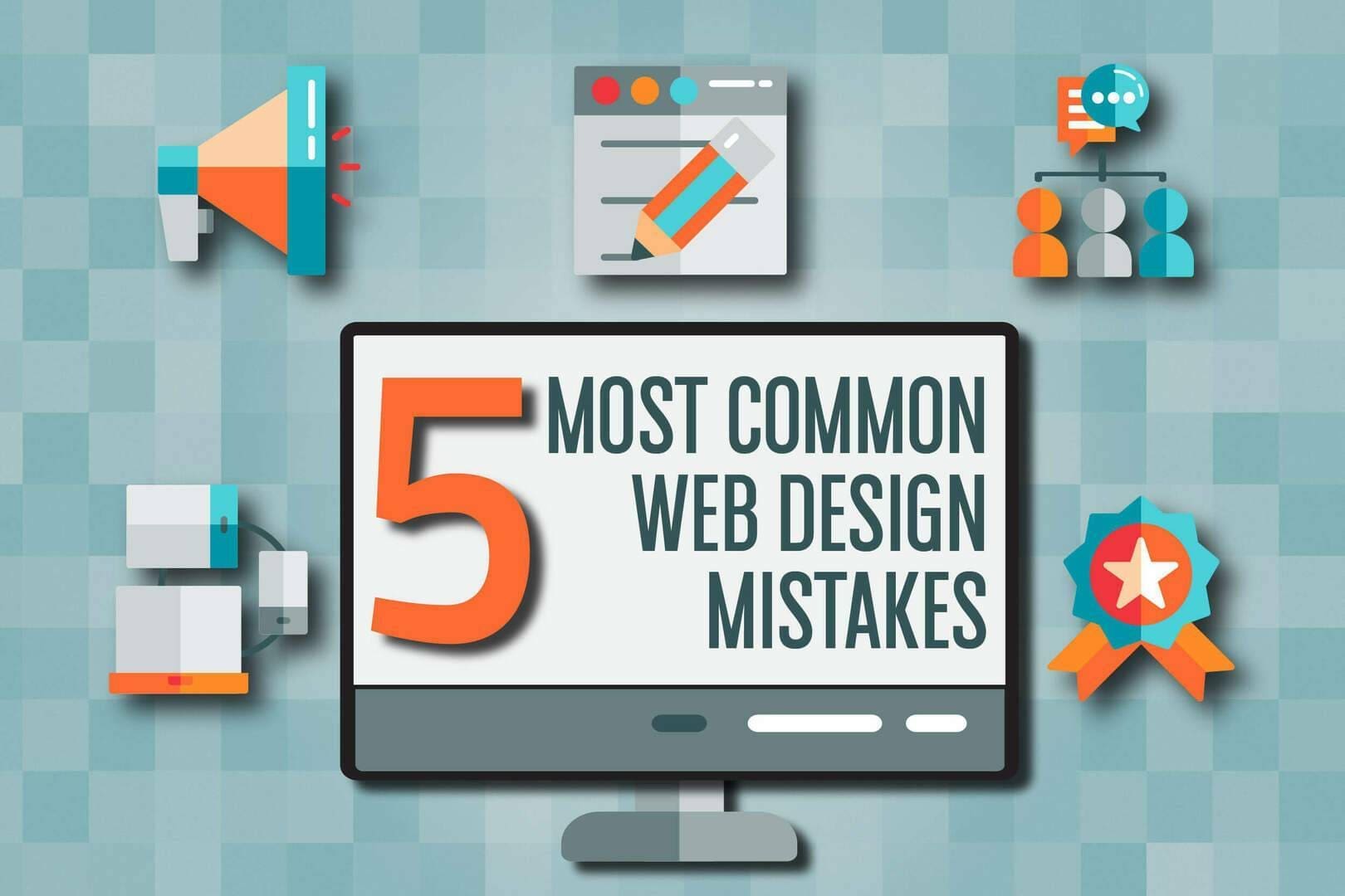
For small businesses, a website is one of the most powerful marketing tools available. It’s often the first point of contact with potential customers, and a poorly designed website can turn visitors away in a matter of seconds. In 2025, a professional, user-friendly, and conversion-optimized website is essential for business success.
Unfortunately, many small businesses make key website design mistakes that hinder user experience, reduce conversions, and ultimately impact their bottom line. But don’t worry! We’ve identified the top five website design mistakes and how you can fix them to improve your site and grow your business.
1. Slow Loading Times
Mistake:
One of the most common website design mistakes small businesses make is having a slow-loading website. In fact, Google reports that 53% of mobile users will abandon a page if it takes longer than three seconds to load. If your site is sluggish, potential customers won’t stick around long enough to learn about your services or make a purchase.
How to Fix It:
- Optimize Images: Large, high-resolution images can slow down your website significantly. Use image compression tools to reduce file sizes without compromising quality.
- Minimize HTTP Requests: Reduce the number of elements on your page (like images, scripts, and stylesheets) to lower the number of HTTP requests made by the browser.
- Use Caching: Caching stores frequently accessed content on the user’s device, speeding up load times for repeat visitors.
- Enable GZIP Compression: GZIP compresses your website’s files, helping them load faster.
Faster websites not only provide a better user experience but also have better rankings in Google search results, which drives more organic traffic.
2. Poor Mobile Optimization
Mistake:
With mobile traffic accounting for over 50% of global internet usage, having a mobile-optimized website is no longer a luxury—it’s a necessity. Many small businesses fail to ensure their website is responsive on mobile devices, leading to frustration for mobile users who struggle to navigate their site.
How to Fix It:
- Responsive Design: Make sure your website automatically adjusts to different screen sizes, from desktops to tablets and smartphones. This ensures a seamless experience across all devices.
- Test Mobile User Experience (UX): Regularly test your website on multiple devices and screen sizes to ensure that fonts are legible, buttons are clickable, and navigation is easy.
- Simplify Mobile Navigation: Use simple, mobile-friendly navigation menus such as hamburger menus or sticky navigation bars to make it easy for users to find what they need on the go.
A mobile-friendly website doesn’t just provide better user experience—it can also improve your Google search rankings since Google prioritizes mobile-friendly websites.
3. Confusing Navigation
Mistake:
Confusing or complex navigation is one of the biggest barriers to a positive user experience. If visitors can’t easily find what they’re looking for, they’re more likely to leave your website and go to a competitor. Clear and organized navigation is key to keeping visitors engaged.
How to Fix It:
- Simplify Your Menu: Use clear and concise categories for your navigation menu. Avoid overloading it with too many options. Stick to the essentials—Home, Services, About Us, Contact, etc.
- Use a Search Bar: Adding a search bar helps visitors quickly find specific information without having to click through multiple pages.
- Sticky Navigation: A sticky navigation bar that stays at the top of the screen as users scroll makes it easy for visitors to navigate no matter where they are on the page.
A simple, intuitive navigation structure improves the chances that visitors will explore more of your website and take action.
4. Lack of Clear Calls to Action (CTAs)
Mistake:
A website without clear calls to action (CTAs) leaves visitors guessing about what to do next. If your goal is to generate leads, sell products, or encourage sign-ups, you need to guide visitors toward taking those actions with prominent and effective CTAs.
How to Fix It:
- Use Actionable Language: Your CTAs should use actionable, persuasive language like “Get a Free Quote,” “Buy Now,” or “Contact Us Today.” Make it clear what the visitor will gain by clicking.
- Place CTAs Strategically: Position your CTAs where visitors are most likely to take action, such as in the header, above the fold, and at the end of each page.
- Make CTAs Stand Out: Use contrasting colors and bold text to make your CTAs stand out from the rest of the page and grab the user’s attention.
Effective CTAs will guide your visitors through the conversion process, increasing the likelihood that they’ll take the next step in engaging with your business.
5. Overcrowded Pages and Cluttered Design
Mistake:
Too much text, too many images, and a cluttered layout can overwhelm visitors and make your website feel chaotic. A cluttered design can hurt your website’s user experience and even cause potential customers to bounce before they’ve had a chance to explore what you offer.
How to Fix It:
- Embrace Whitespace: Use whitespace (or negative space) to separate elements and give your design a clean, organized look. This will make your content easier to digest and more visually appealing.
- Limit Text and Graphics: Keep text concise and relevant. Use bullet points and short paragraphs for easy reading, and avoid cluttering pages with unnecessary images or content.
- Focus on Core Content: Prioritize the most important content and keep the design minimalistic. Stick to key sections like services, testimonials, and contact info.
A clean, uncluttered website design not only looks more professional but also makes it easier for users to focus on the information that matters most.
Conclusion: Create a Website That Works for Your Business
Your website is one of your business’s most valuable assets, so it’s essential to avoid these common website design mistakes. By optimizing loading speeds, ensuring mobile compatibility, improving navigation, using effective CTAs, and maintaining a clean design, you’ll create a website that not only stands out but also converts visitors into loyal customers.
At Business Technology Management, Inc., we specialize in creating user-friendly, responsive, and high-converting websites for small businesses. If your website is in need of a redesign or optimization, contact us today, and let’s work together to make your site the best it can be.